5 QuickMAPS ii: Baseline page
The view which next appears has default components which appear on all pages, irrespective of whether sub-national, or national, data have been retrieved. This section describes the Baseline presentation of food systems data, a separate section describes biomarker data, which can also be selected from this interface.
5.1 Baseline data information section
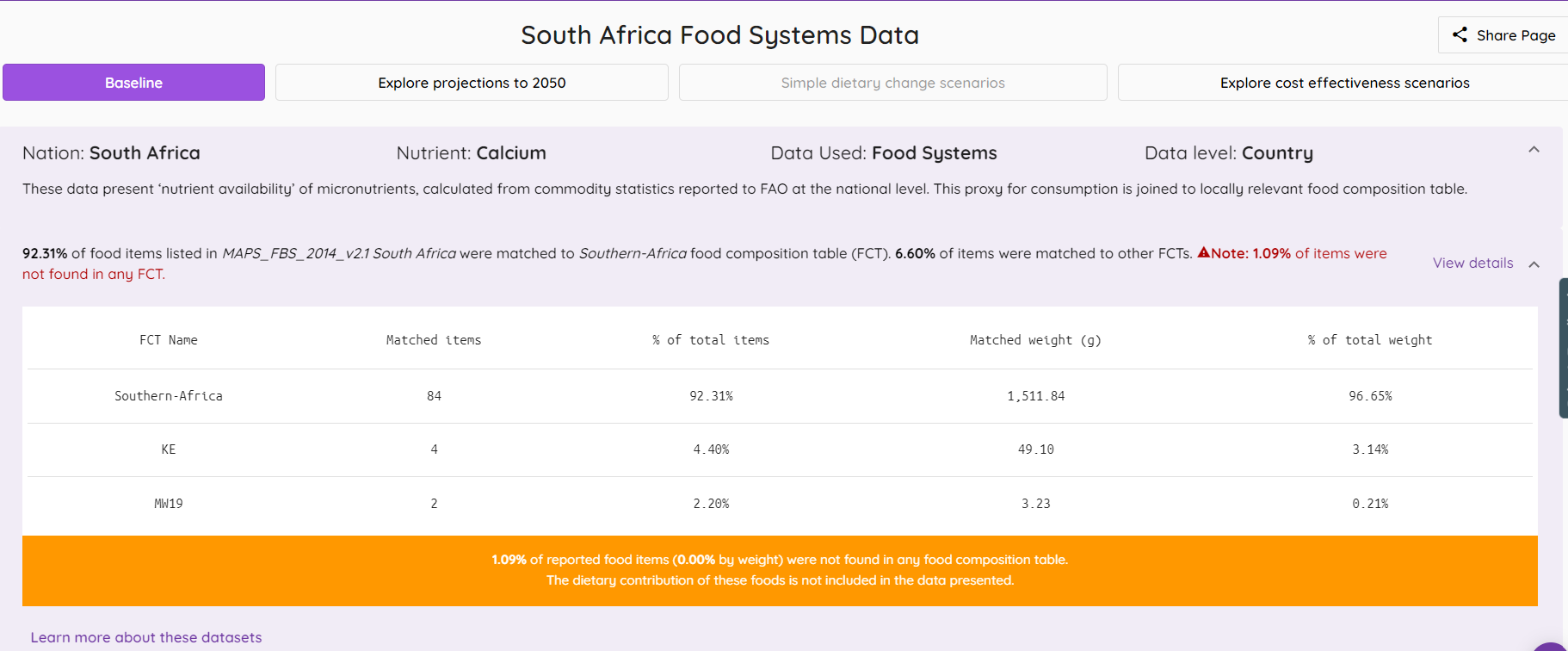
The format of the upper part of the screen is consistent for all food systems data in QuickMAPS. The example below shows that of calcium in South Africa.
These are described with reference to the index image below.
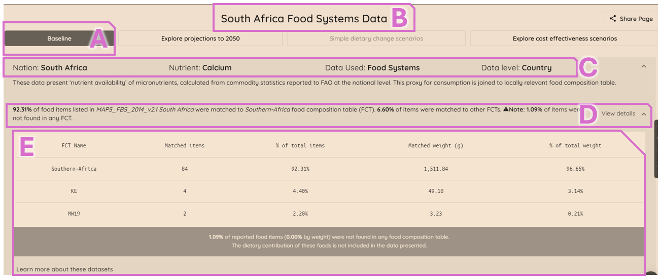
The ‘baseline’ header (area A on the index image) confirms this to be the QuickMAPS baseline view for the chosen country and micronutrient (area B).
The title banner (area C) provides information on the country, micronutrient, and confirmation that food systems data is being used.
The title banner then also provides more detail on the food composition data which the tool has matched to the information on food availability/apparent intake. The extent to which the foods have been matched to food composition data is provided (area D), and the proportion of foods matched to individual composition tables is provided. This also, importantly, summarises the proportion of foods which were not matched and thus were not included in the model outputs on the screen below. Further details on these are able to be seen by expanding the window (using the ‘view details’ arrow immediately to the right of the letter D).
Additional information on the food composition data being used is shown in the drop-down area (E on the index image), with the number of items, and their contribution by weight, used from each source dataset. This also shows the number, and proportion by weight, of items not matched in the MAPS tool and therefore excluded from the model results shown in the screen below. These data are provided to support methodological transparency.
Either two or four ‘cards’ are then presented on the page, depending on whether the tool has national scale food balance sheet data (two cards), or sub-national household consumption and expenditure survey data (four cards) loaded. The options available on these cards are summarised below - those appearing on all cards are not repeated after their first occurrence.
5.2 Geographic presentation
A map of the data is shown, on the top left when in default presentation mode. Where food balance sheet data is presented, then there is only one summary value for the whole country (reflecting the input data). Where sub-national data is shown, the data is disaggregated to the first administrative level. An example of each of these is shown below.
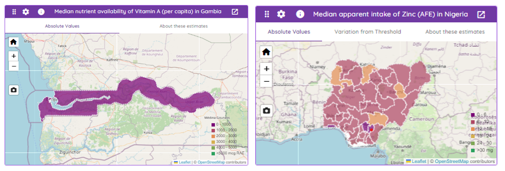
In both cases the polygons on the map (i.e. the shaded area(s) within the country of interest) can also be interacted with by hovering over them until a pop-up appears, containing numerical summaries. The information contained on this mapping interactive graphic shown in the index image below.
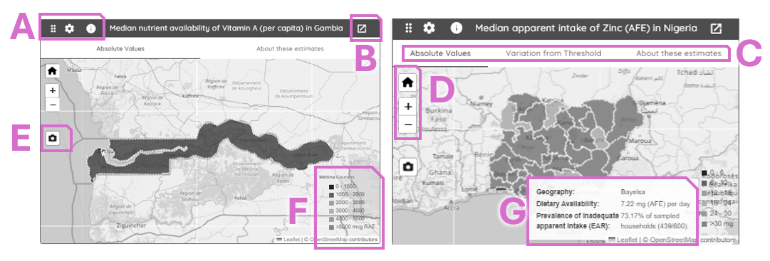
Area A: The leftmost one (six dots) does not alter the data view; the central icon (cog) allows the user to alter the colour shown on the mapped area - this can be particularly useful where the default colours are not sufficiently distinct for a user; the rightmost icon (an “i”) provides some summary information about the estimates presented.
Area B: The card can be expanded using this pop-out arrow option; this is available on all cards.
Area C : Two mapped views are available for the sub-national data, with the default showing absolute values and the option showing the ‘variation from threshold’, whilst only the default absolute value is available for national data; additionally some summary information about the estimates presented, which is identical to the link using the “i” icon in area A.
Area D: The window has options to move around geographically (using your device mouse/track-pad/touch-screen) and to zoom using the plus (+) or minus (-) symbols; the ‘house’ icon will restore the optimal zoom level for the chosen geography, and can be used to readily restore this view.
Area E: this camera icon allows an image of the map to be saved, and provides an option in addition to users’ screen capture options.
Area F: this is the legend for the colour used on the map, and will update depending on the colour ramp chosen if the default is altered (area A).
Area G: whilst hovering over an area (national or subnational) a pop-up will appear which provides summary information for the area.
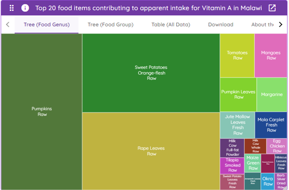
5.3 Foods contributing to the micronutrient estimates
The top twenty food items (by weight) are presented for both national and subnational estimates. This takes the form of a “treemap”, where the foods are ordered from largest to smallest contribution, and the area is proportional to the quantity from these twenty items. An example of this is shown below.
The index image below shows some of the key options on this card, which are not already described above for the mapped image card.
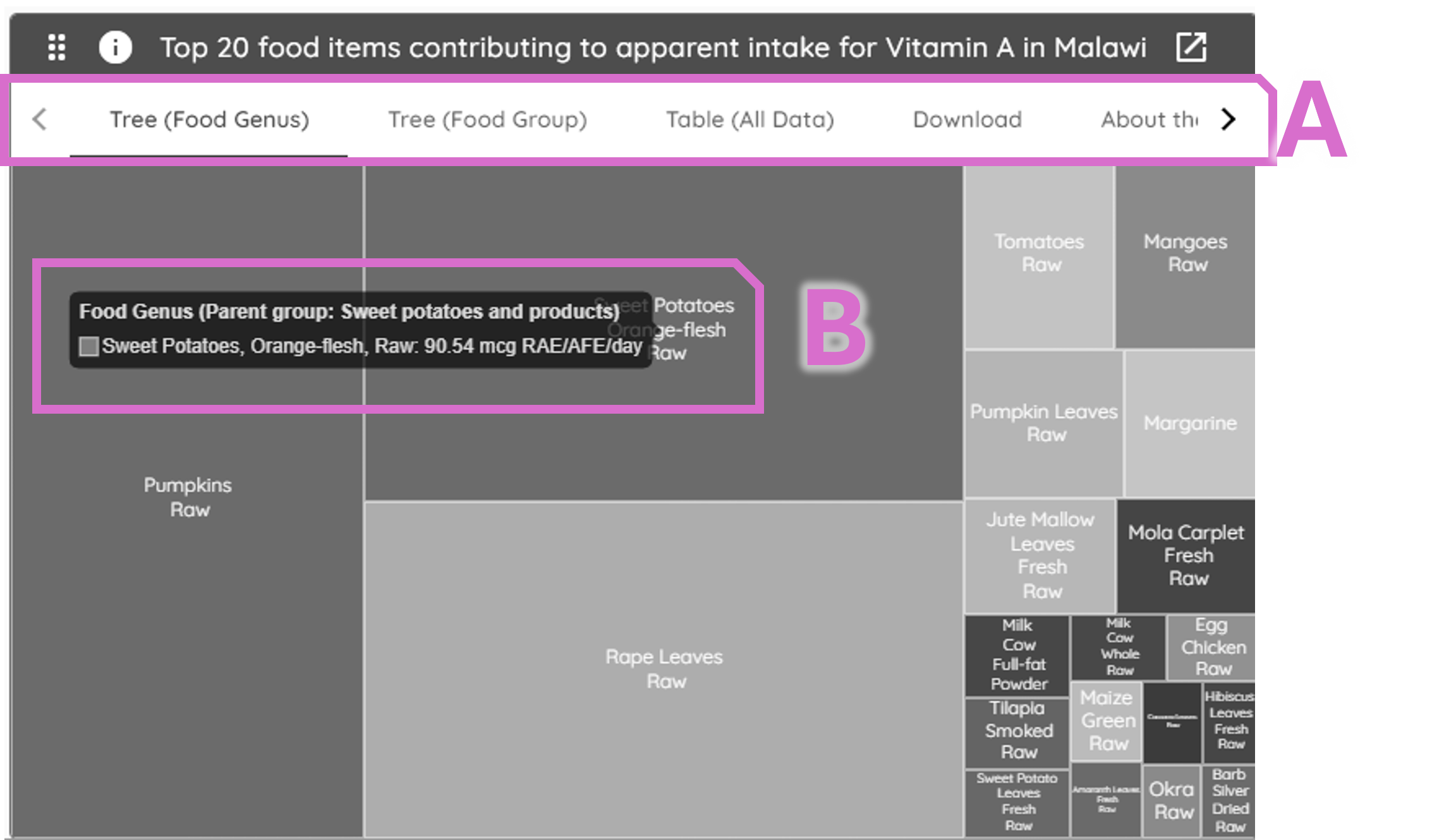
Area A: The card defaults to showing food items at their most disaggregated level (Food Genus), alternatively the Food Group option can be selected to view the data aggregated too food group level. The data table for the top twenty foods can be viewed using the “Table (All Data)” option. Download of these, and an accompanying citation, can be accessed through the ‘Download’ option. There is a short summary of the information presented in ‘about these estimates’ (most right-hand option).
’Area B: similar to the mapped image, the distinct areas within the image are interactive, and the data can be viewed through a pop-up visible when the cursor is moved over each area.
5.4 Seasonality information
Subnational data arising from household consumption and expenditure surveys often includes data which provide monthly disaggregation. These are shown as proportional stacked bars.
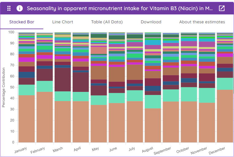
The options for this graph card are consistent with those described above, including the interactive option when the cursor is moved across areas of the graph. As an alternative to the default, a line chart can be viewed if preferred. The options to view the data and download either images or data are consistent with the treemap (above), as is the option to read a method brief summary in ‘about these estimates’.
5.5 Histogram
The distribution of household apparent intake is shown in a histogram; this is only available where subnational data are loaded.
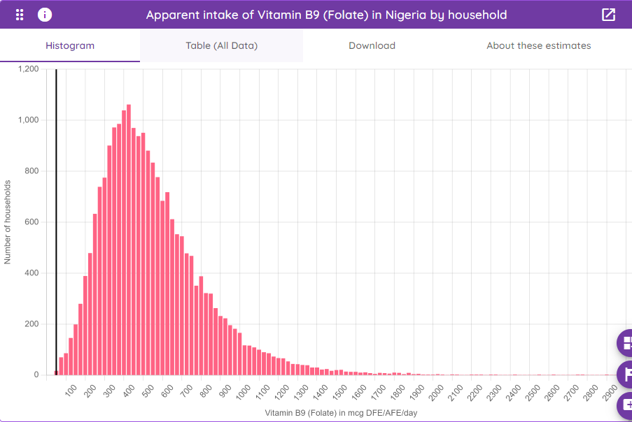
The histogram shows the distribution of the apparent intake of the chosen dataset; the Table (All Data) option shows the data to replicate this histogram, namely the count of households in each histogram bin. The options Download and About these estimates are as for the Seasonality card above.