7 QuickMAPS iv: Biomarker data
7.1 Biomarker data selection
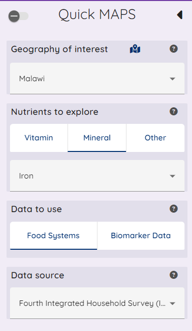
The instructions to select country and nutrient in the Baseline sidebar will reveal the Biomarker option, if the combination of country and nutrient have biomarker data loaded. When this is the case, the Biomarker option shows no longer greyed out, as in the image below.
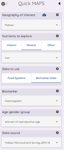
When selecting the biomarker button, the options specific to this data type are then made available as shown in the image below.
These additional options are highlighted in the index image below
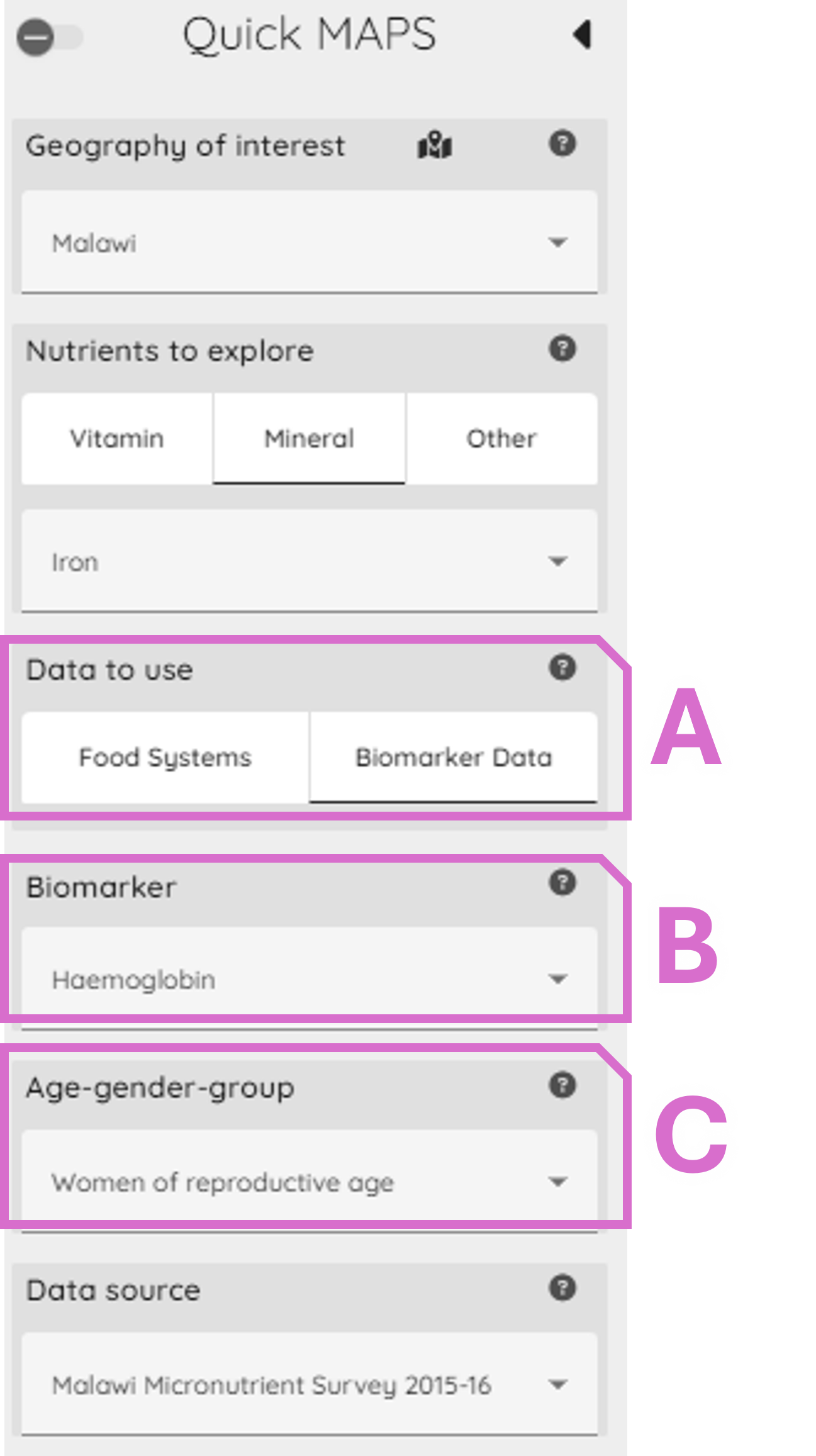
Area A: This confirms the biomarker data option is selected as described above.
Area B: The user can choose the biomarker where more than one is avaiable.
Area C: The user can choose the demographic group they would like to explore data for.
7.2 Biomarker data information banner
The information banner for biomarker data is structured in a consistent manner to the other QuickMAPS data banners described in sections above, and a biomarker example is shown below.

As with food systems and projection data, the banner provides information on the data selected, and the proportion of data which falls below the applicable threshold(s) for the selected data is shown in the bottom section of this banner.
7.3 Biomarker disaggregated data summaries
The default presentation of the data is a graphical presentation disaggregated by wealth quintile, which follows a similar structure to other options described in earlier sections for Baseline and projects. The summary data is available under “Aggregated Threshold Percentages”, and further information under “About…” header options. An example of this is shown below.
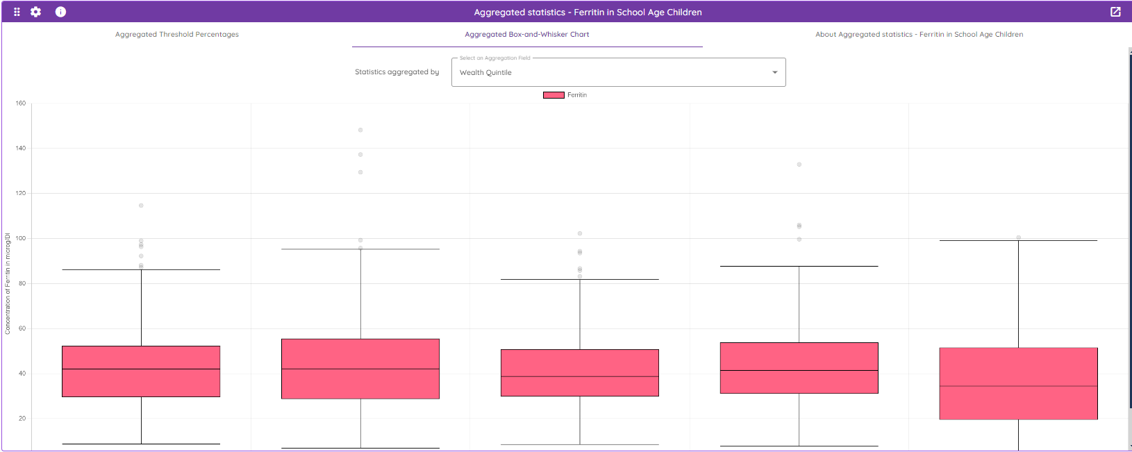
There are a number of visualisation options available in this window, with the data summary shown in “Aggregated Threshold Percentges”. It is also possible to switch from the aggregation of “Wealth Quintile” to “Urbanity”, or level 1 administrative region usinig the drop down menu option at the top of this screen.
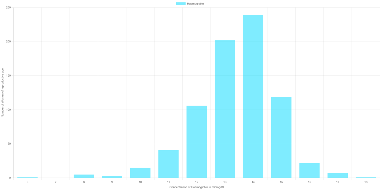
7.4 Distribution of the biomarker data
Further summary information is provided through a histogram and table of summary statistics of the overall dataset (country-nutrient-demographic group) of biomarker data in the lower window of this section of the MAPS tool. An example of this is shown below.