6 QuickMAPS iii: Projections
The projections page takes the country and nutrient selected in the ‘Baseline’ page of QuickMAPS, and provides national-scale projections of nutrient availability where these are available. To alter the nutrient availability being viewed, follow the instructions to change the country and/or nutrient which can be found in section 4.4.
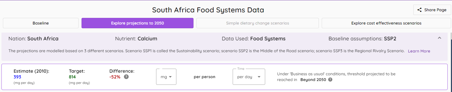
6.1 Information banner
The information banner at the top of the page is structured in a very similar way to that of the Baseline page: an example is shown below of the projection page.
The information uniquely provided on this page is described using the index image below.
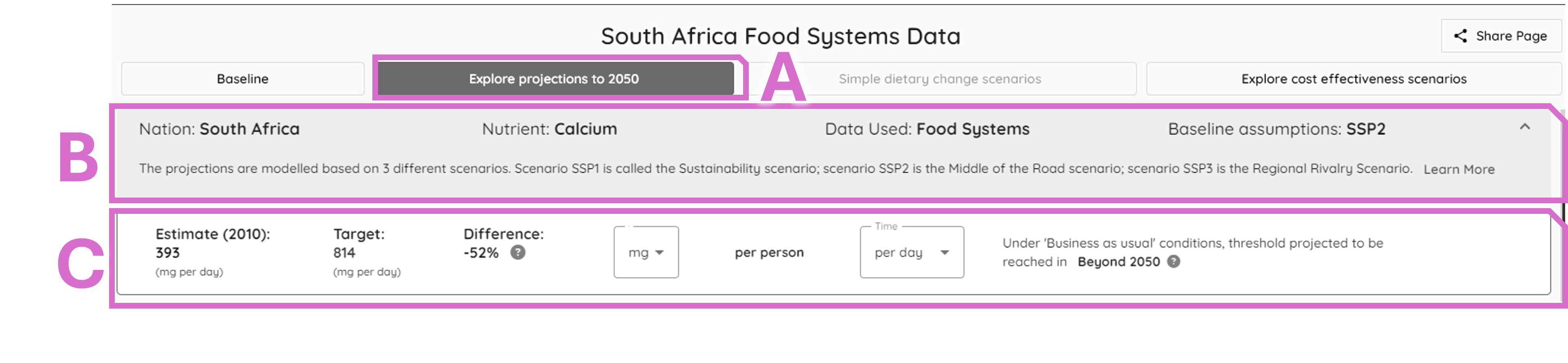
Area A: confirms the projections tab is selected
Area B: A summary of the country, nutrient, food system data (as for Baseline), and the default model selected which is SSP2 (see below).
Area C: The 2010 estimate is compared to the threshold used in the Baseline page, to explore the difference between these data and when the projections are expected to reach the threshold.
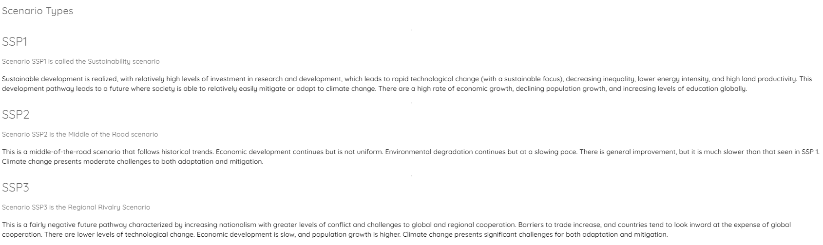
6.1.1 Shared socioeconomic pathways (SSP)
The default model used is SSP2; further information can be retrieved about the Shared Socioeconomic Projections (SSP) by selecting the text “Learn more” on the right of area B. When selected an explanatory pop-up can be viewed, as shown here.
6.2 Nutrient availability projection graph
Below the information banner, the default view presents the nutrient availability projection graph, which includes all three SSPs (as described above), and the nutrient threshold (identical to that in area C of the banner, above) as a horizontal red line. As with other graphical presentations, these graph lines have a facility to pop-up the underlying data when the cursor is placed above the data points.
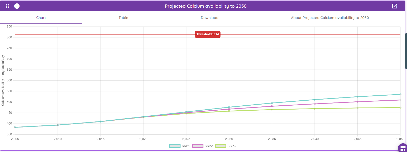
This graph interface is structured in way which is consistent with the Baseline page graphs, with a default graphical view and alternate options to view the plotted data (“Table”), to “Download” the graph or plotted data, and to find a brief description of the presented data (“About Projected Calcium availability to 2050”).
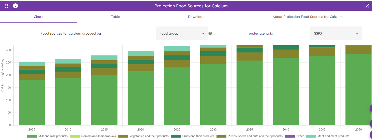
6.3 Nutrient food source projections
Below the SSP nutrient projections graph shown above, a further interactive graph is available which shows the key food sources which these projections comprise.
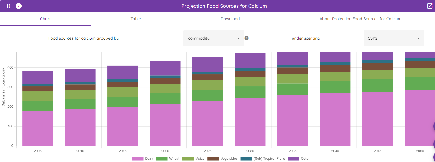
This graphic is structured in the same way as the other Baseline and the nutrient projections graph - the default presentation is the graph but the plotted data is available, as are the downloads and further information shown for other cards. Additional functionality is found in this card, as highlighted in the index image below.
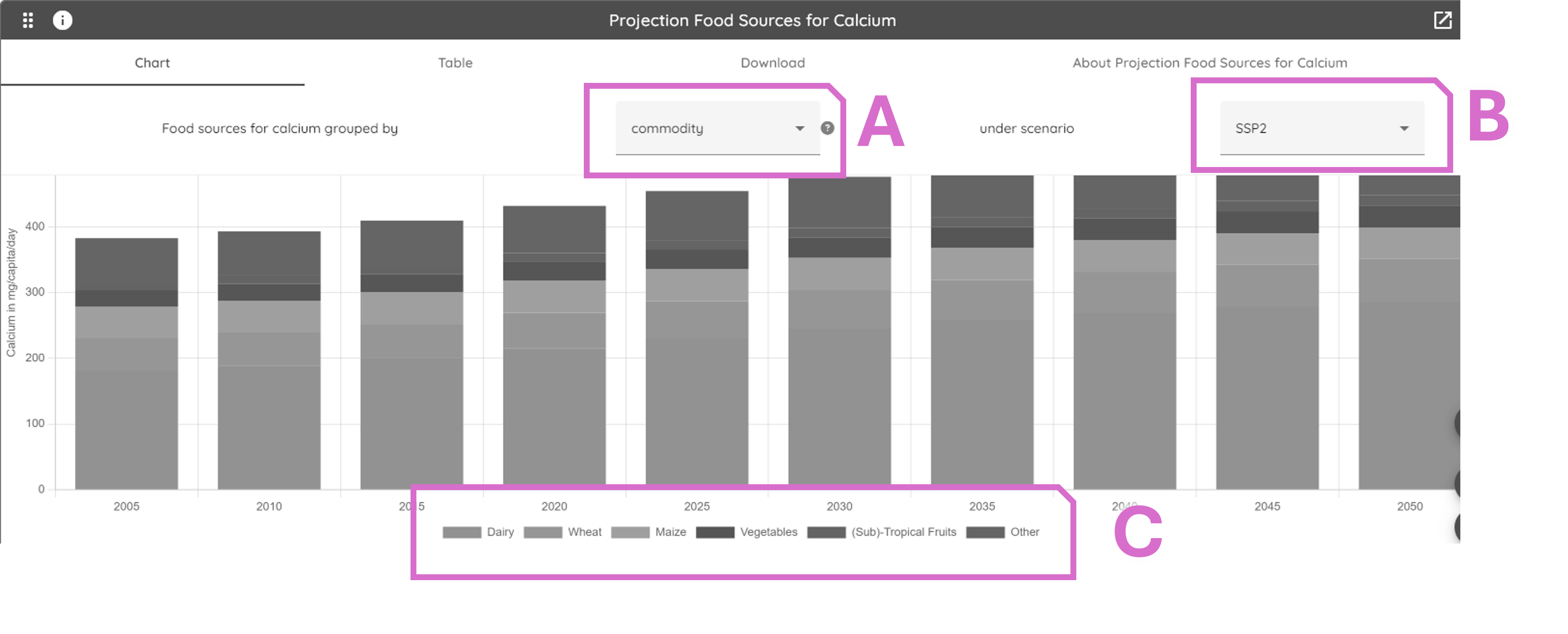
Area A: The default view is of the foods described as commodities; this can be altered to ‘food groups’ using the dropdown option.
Area B: the default view is SSP2, but the user can choose SSP1 or SSP3 (see above): these options can be selected for either the commodity or the food group display.
Area C: The legend describes the food sources in the graph area.
The legend (area C) can also be used to reduce the presented data to show the commodities (or food groups) of most interest to the user. When these are deselected, the name appears as a strikethrough font as shown in the image below, and the y axis of the graph recalculates to maximise the visible bars. In this case food sources are summarised by food groups and SSP3 results are shown.